Typographic development of anOrdain
August 23, 2018
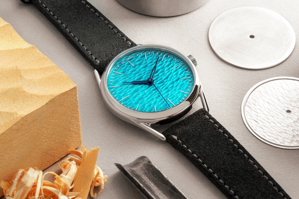
A key element in the creation of the Model 1 was the design of the numerals. They were among the first things we developed, but they helped inform the rest of the design process, with the hands, and even the lugs, borrowing forms from the typeface.
Here we discuss the story of the typeface and the processes involved in its creation.
A lost art form
It wasn't long ago that cartography was an artistic pursuit. Map-makers not only needed an understanding of geographical features, but also a steady hand, and an aesthetic eye, with which to present their findings in map form.

anOrdain was first conceived in the Scottish Highlands and at the early stages of development we took a great interest in vintage Ordnance Survey maps from the region. We were taken aback by the level of detail and care that had gone into drawing the maps, and how each map had its own uniqueness that could only come about through hand-drawing.
"The intricacy and beauty from that era of pre-digital cartography was really inspiring, even the lettering on early maps was all hand drawn. The level of skill required to create some of the maps is staggering and it seemed relevant to what we were wanting to do at anOrdain" says Imogen Ayres, our Typographer.
The numerals

"When it came to developing a typeface for anOrdain I wanted it to retain some of the hand-drawn qualities from the OS maps. Much of the text in the maps we were looking at was not much larger than what would be needed on a watch dial, but was still perfectly legible and full of character."
"In the end we created two typefaces, one for the hour markings and another for the minutes/seconds. They're easily distinguishable but complement each other in a similar way to the lettering we looked at in the maps."
A holistic approach

As the typeface began to take form, angles and shapes for watch cases, hands and indexes began to emerge.
"The hands we arrived at by looking at vintage compass needles, which we felt were in-keeping with the lettering. In the lugs we included angular cuts, which references the harsh, angular shapes of the letterforms."
As we develop more watch models, typography continues to be an important element of everything we're doing.
Related articles